Content Writer
Marlyn Pereira is a Content Writer at Design Shifu. She writes blogs and articles about graphics. In her spare time, she loves tinkering with digital art and designing. She is an avid reader and is extremely passionate photographer.
Did you ever create the perfect design but then you printed it, and it was something completely different? Your text was cut on the edges, your colors were all wrong or it just turned out blurry? You probably made one of these amateur print design mistakes.
Don’t worry. It’s fixable! In this blog, we will talk about the top 5 print design mistakes one is likely to make, and how to avoid them.
Print Design Mistake #1. Bleed Margins
In printing, bleed is the area or the edge of the sheet that is going to be trimmed off. While thinking out of the box is a great way to go about with designing, you have to make sure that your design remains inside a box so that it doesn’t get cut off while printing. The trick is margins!
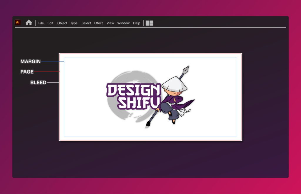
Without set margins, you may end up putting your text or other elements of your design, too close to your document’s edge. 3mm of bleed on all sides is usually good enough to avoid losing parts of your design while printing.
Print Design Mistake #2. Low Resolution
Resolution can be described as tiny dots of color that make up a digital image. Resolution is commonly measured in pixels per inch or PPI, but for print, you need to look at DPI.
DPI means dots per inch. If your printed images are turning out to be blurry, you probably need a higher DPI. A higher DPI means high pixel density in an image which will result in sharper print.

300 DPI is the usual standard for printing. However, it is important to note that dots per inch count alone won’t cut it. The resolution has to go hand in hand with the correct size.
Print Design Mistake #3. Wrong Color Profile
The first thing to look at when you’re creating a design is where it is going to be used.
If your design is going to appear on a digital screen it should be created in RGB color mode. RGB stands for red, green, and blue – the colors of light screens use to display a range of colors.
If the design is going to be printed, use CYMK color mode.
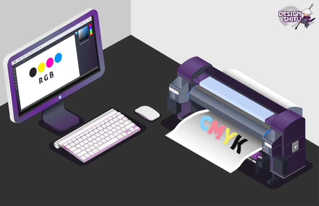
Printers use CMYK (cyan, magenta, yellow, and black) inks to render images. When you design in CYMK color mode, you are already seeing what is going to be printed. This way, you can avoid unwanted surprises like getting different colors printed by mistake.
Print Design Mistake #4. Crowding with Font and Text
Often print design mistakes are layout mistakes. Sometimes when you print a design, it simply looks shabby and illegible. Some things to avoid to make your design more readable.
Don’t use more than two fonts. Overcrowding your design with different typefaces and fonts will only make it illegible and annoying to read.
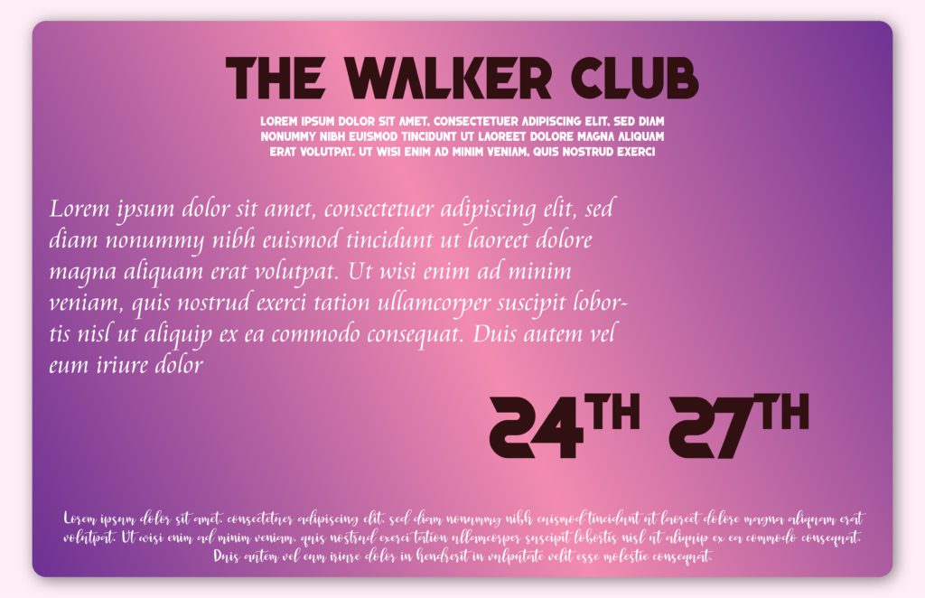
Kern your text. Kerning is the space between text characters. When kerning is not done right your text becomes different to understand.
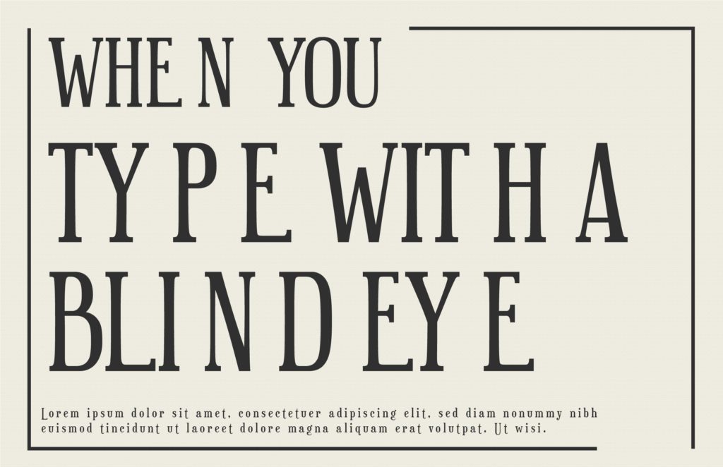
Don’t overload your design with text. Less is more. Be concise and crisp.
Print Design Mistake #5. Saving the Right Format
There are a lot of image file formats that you could save your design image in, but which one should you choose for a design that you want to print?
Think about whether or not the image needs to be in a raster or vector format. Raster images are made up of pixels while vectors are made up of geometric lines and curves, which means they can be scaled to any size while keeping their shape.
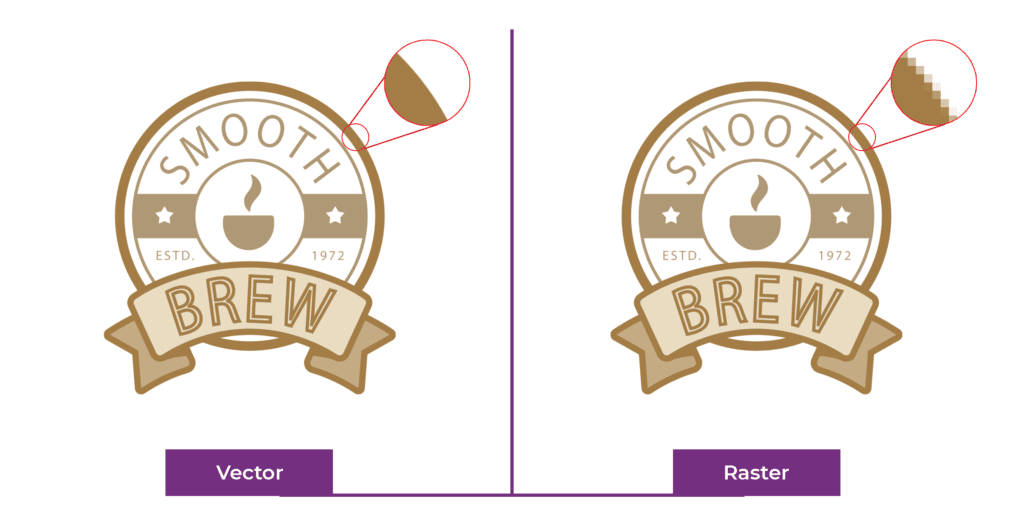
If you are worried about your design getting pixelated, always make your design bigger than it has to be. You can always reduce resolution, but you can never increase it.
Pro tip – Proofread
Always proofread the text on your design before you finalize it. Even though you aren’t the writer, before giving out the design, one glance at the text can save a lot of time that could go into re-editing.
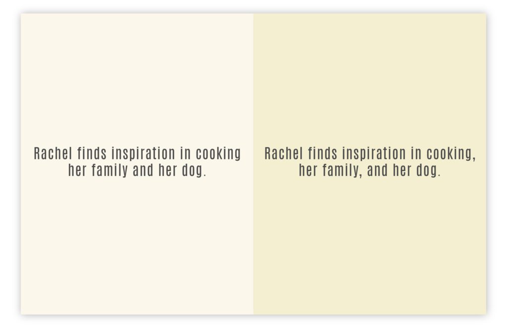
One grammatical error one misplaced comma can change the meaning of a text entirely. Spelling errors, grammatical mistakes, etc make your brand look unprofessional and customers don’t take it kindly.
We hope the tips provided in this article to avoid print design mistakes come in handy the next time you plan to create a print design.
If you still feel that you would like to avoid the hassle of going through this then you could always ask Design Shifu to help you create the perfect printable designs for your brand in just 24- 48 hours. Check out our portfolio and our pricing page to know more.


