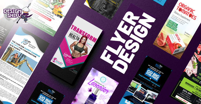
Top tips for creating the perfect flyer design
At DesignShifu, our dedicated professional designers are dab hands at creating eye-catching flyers that entice and grab attention; they achieve this using their years of combined experience in graphic design.
In this article, they share some of the secrets they use to help create the perfect flyer design.
1. Sort your Strategy
When submitting a brief for flyer design, it is important to have a clear strategy on what you want the flyer to achieve. Where will it be distributed? Who is the target audience? What message does it need to convey? Only once you have these questions answered, can you decide what size and shape of flyer is required to best showcase the content you want to include in the most meaningful way. It is likely that you will not be able to include everything you wanted to say on the flyer. The key is to focus on the core elements and messages that fit with your flyer design objectives and will resonate most with your target audience.
2. Opposites Attract
Using plenty of contrast in your flyer design will help in getting key messages or images to stand out. Flyers need to have a strong pull to attract attention and encourage people to gravitate towards it. One idea to test the contrast levels is to hold the flyer at a distance. Do the various elements hold their own alongside the others or do they all blend into one? Does it draw you in to want to find out more?
3. Focus on Keywords
Depending on your strategy, it can help to emphasize certain keywords on your flyer design to communicate the core message immediately. Are you offering something for free? Is it a limited time offer? Is the product or service new? Are you hosting an event at a certain time or place? Making these words bigger, bolder or brighter can really help to boost the impact of your flyer design and get your point across faster.
4. Final Position
Another factor impacting your choice of flyer design is the viewing distance. As mentioned above, testing out the viewing distance for your flyer will help you to ascertain if certain design elements are having the impact you desire. Will it be hung in a window? Handed out to passers-by? Or a flyer that will be picked up or mailed out to people? Everything in the design should be scaled appropriately for its final use.
5. Call to Action
As part of your initial strategy stage, one element should be your desired call to action. What do you want the flyer make people do? It may not have a clickable link like an email or a website page does, but that does not mean your flyer design cannot prompt your audience to take action. Do you want them to call you, visit a website or show up at a certain place? Whatever action you want people to take, make it as easy as possible for them to work out what they need to do.
6. Professional Printing
While printing your final design yourself may be an option you consider (depending on time constraints and budget), many office and home printers cannot print full bleed. Full bleed is when the flyer design goes all the way to the edge of the paper, with no border. Using a professional printer can help you achieve a more professional look, rather than looking like it has been printed at your home or office.
7. Top to Bottom
Just as you would read the pages of a book, flyers are also read from top to bottom so your flyer design should reflect that. Place the most important information at the top of your flyer, with less important information progressively further down. As mentioned above, putting emphasis on certain keywords can also help draw attention, so you could use both the size and placement of certain text to reflect how important they are.
8. High-Resolution Images
This may sound obvious, but nothing makes a flyer design look more professional than high quality imagery. However, it is important to ensure the image chosen reflects your strategy and does not dilute your message. Images should be easy to interpret, sharp and clear.
9. Make it your Own
While the focus of your flyer design may be to promote a product, service or event, ensure that your audience knows it is by you. If they do not already know your business, over time, people will come to recognize your marketing as distinctively yours by using your logo, brand colors, fonts and overall style.
10. Templates
Most standard flyers can be designed using set printer templates. These will show trim lines, bleed lines as well as the safe areas for printing. Sticking to these guides can help ensure that certain elements of your flyer design are not cut off when printed.
If you have been considering flyer design yourself, why not speak to the experts at DesignShifu? We are ideal for individuals and businesses of all sizes. Our flat rate graphic design service offers affordable, fast and professional flyer design, supported by a 14-day 100% money back guarantee.
Click here to find out more about our various subscription plans.


