Content Writer
Marlyn Pereira is a Content Writer at Design Shifu. She writes blogs and articles about graphics. In her spare time, she loves tinkering with digital art and designing. She is an avid reader and is extremely passionate photographer.
Flyer designs are one of the most widely used tools for advertisements. Flyers can be used for offline marketing as printed flyers or for online marketing, like newsletters. They are amongst the most affordable and versatile promotional tools as they offer a cost-effective solution for mass distribution, as compared to other forms of advertisements.
However, creating a flyer design for your marketing promotions can be tedious and confusing if you are new to this. This is why we have come up with these steps that you can follow, to create an eye-catching flyer that looks creative and professional.
When designing a flyer, there are two aspects that you need to take into consideration, how attractive your flyer looks, and how sellable it is. We will delve into these two points in the coming sections.
The Marketing Perspective
1. Strategize and Plan your Message
To create an effective flyer you have to first understand the aim of the flyer, the target audience, and the message you want to convey. Plan what you want your flyer to talk about and how to deliver the message in your flyer design. Understanding these aspects will help you write a copy that is concise, crisp, and impactful. Set the focus on the keywords of your message by making them bolder or brighter.

Once you have your concept and copy ready, the next thing to look at is…
2. Call to action
A call to action (CTA) is used to prompt a response from your audience after they have read your flyer. Regardless of whether yours is a flyer online or offline, you can add a CTA to it. For example, a CTA on your online flyer can have discount codes or coupons encouraging the audience to make a purchase. A CTA on your printed flyer, on the other hand, can persuade the audience to get in touch with your business through a phone number or an address.

3. Reflect your brand character
Consistency in your design makes your brand familiar and recognizable. Incorporate the identity of your brand into the design for your flyer. Use your brand color scheme or your style in the flyer design to make it your own. You can place your logo strategically, enough for it to stand out, but also be balanced with the other elements of your design.
Now that we’ve gone over the concept, aim and the copy of the flyer. Let’s look at the design aspect.
The Designing Perspective
4. Keep it simple with your colors
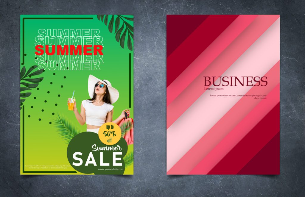
To make a flyer eye-catching you don’t have to overcomplicate it. Keep it simple. Stick to two or three colors that complement and contrast each other on the color spectrum. Don’t be afraid to use bold colors, but balance their presence with each other.
5. Font Style
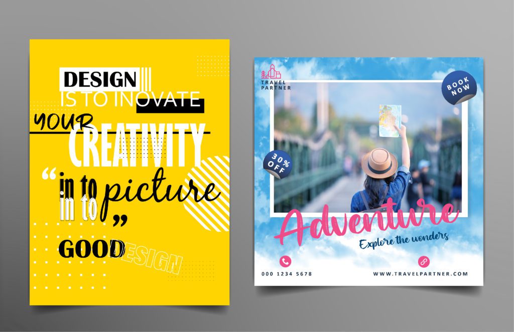
Using more than 3 font styles on a flyer is not a good idea. Choose two or three fonts that go together, that are appropriate for your message. For example, a serious message is not conveyed through a decorative or cursive font. Don’t forget to keep a negative space between your words to maintain legibility in your flyer design.
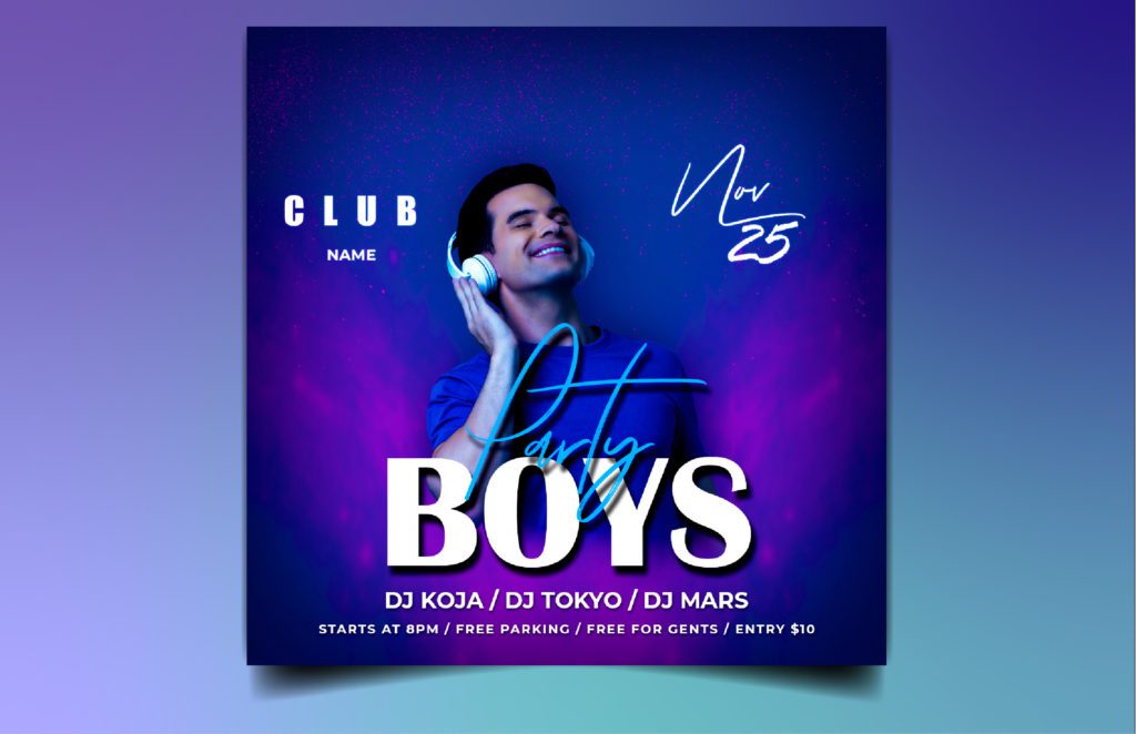
6. Pick the right kind of paper
If you intend to print your flyer, it is important to choose durable paper. Use a professional printer to print your flyers, this will make them look more formal and credible. You can also add a layer of gloss or matte finish to the thickness of the paper.
Pro tip – Keep a ⅛ inch or .125 inch bleeding margin while printing your flyer, so that you don’t lose out part of your flyer design.
Whether it is a digital flyer or a printed flyer, make sure you use high-quality images for your flyer design. The ideal resolution for images that are meant to be printed is 300 dots per inch (dpi). Choose the dimensions for your image as well as the angle at which you want to place your image in the flyer design carefully. The image along with your text should be in alignment, leaving some negative space on the flyer design, to ease the eye of your audience.
7. Use High-Quality Images
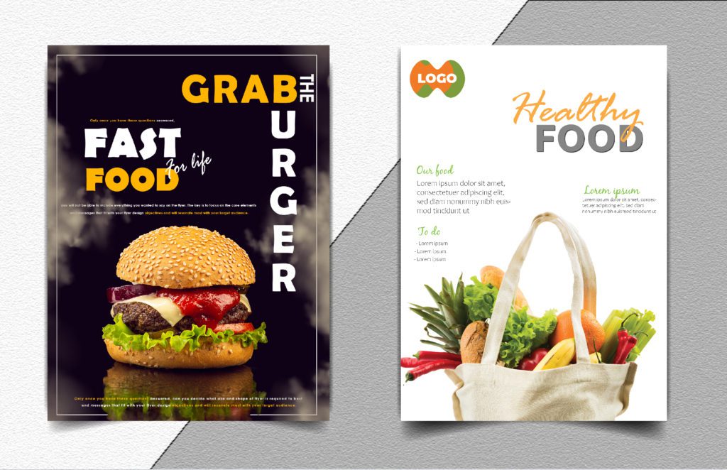
8. Choose your style
You may have a lot of options to choose from for your flyer design, but choose a style that reflects your brand image. Go minimalist. It is neat and straightforward. The ample use of negative space in the flyer design will make the audience focus only on what is necessary. Or on the other hand, go all out, and explore with bold fonts, shapes and sizes, more colors, grungy and rough textures and make your flyer stand out. Add illustrations to your flyer design and layer it with your content. You can take a look at our portfolio to understand different styles for different designs, for inspiration.

9. Strategize with Shapes
Highlight your content by using a semi-transparent square or a circle shape and draw attention to what you want your audience to read. You can even tweak your text into a shape or tilt the text in alignment with the shape, to get creative. Use leading lines in your flyer design. Leading lines are used to lead the gaze of the audience to what the designer wants them to focus on.
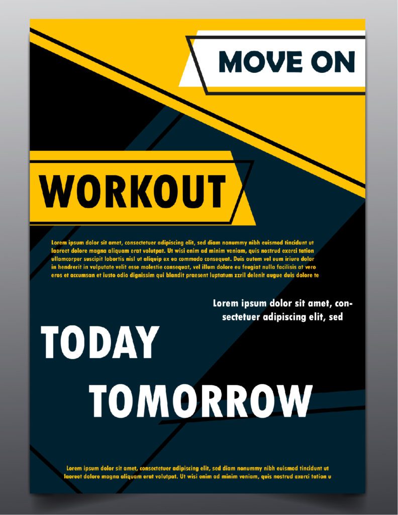
10. Play with Patterns
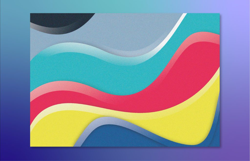
Make visual statements in your flyer design. Use abstract patterns like color blots or splashes on your flyer to make it a little artsy. Or you can use rigid lines and shapes to create a pattern with an ingrained message. The human eye is conditioned to recognize familiar shapes, this can be used in flyer design. You can also use patterns to create layouts for your flyer design, in case you want to showcase your products, etc, or create borders around images or products to make the flyer design look more creative.
Bonus tip –
Always make a digitized copy of your flyer design, in different dimensions, to repurpose it as content for emailers, in case you need to use your flyer design for promotional purposes.
With these handy tips, designing your own flyer is now easy. However, if you’re looking to give your flyer a professional touch. at Design Shifu, our designers aka Shifu’s handle daily design requests from businesses of all sizes at affordable prices, with quick turnaround time and a 14-day money-back guarantee. Check out our subscription plans here.


